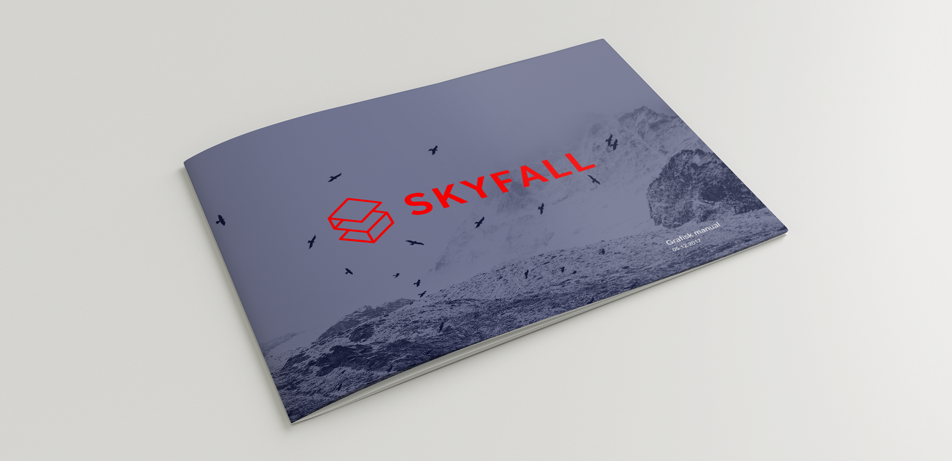
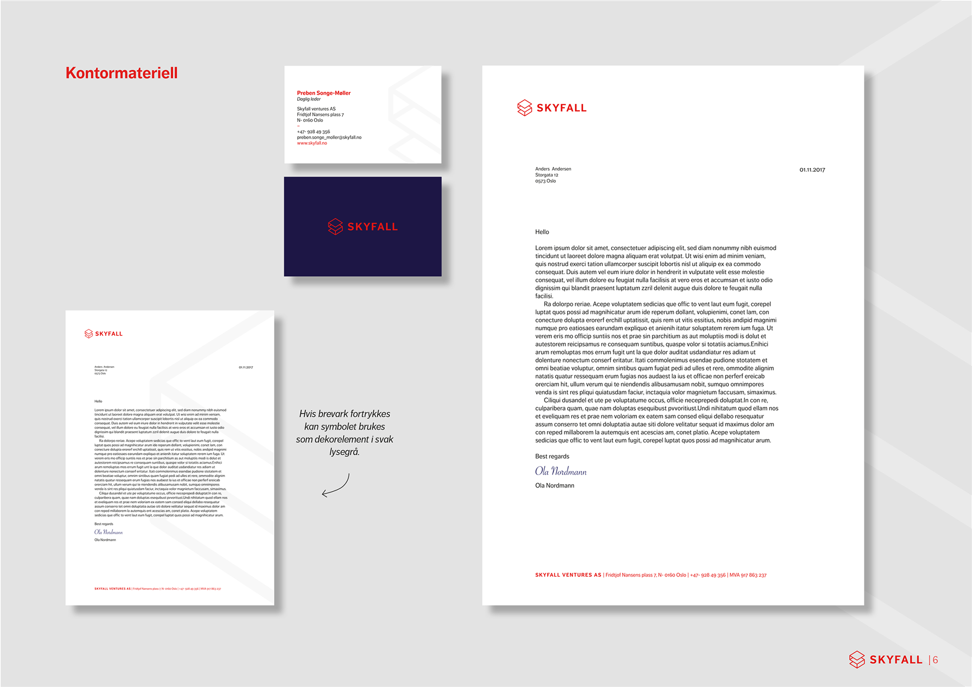
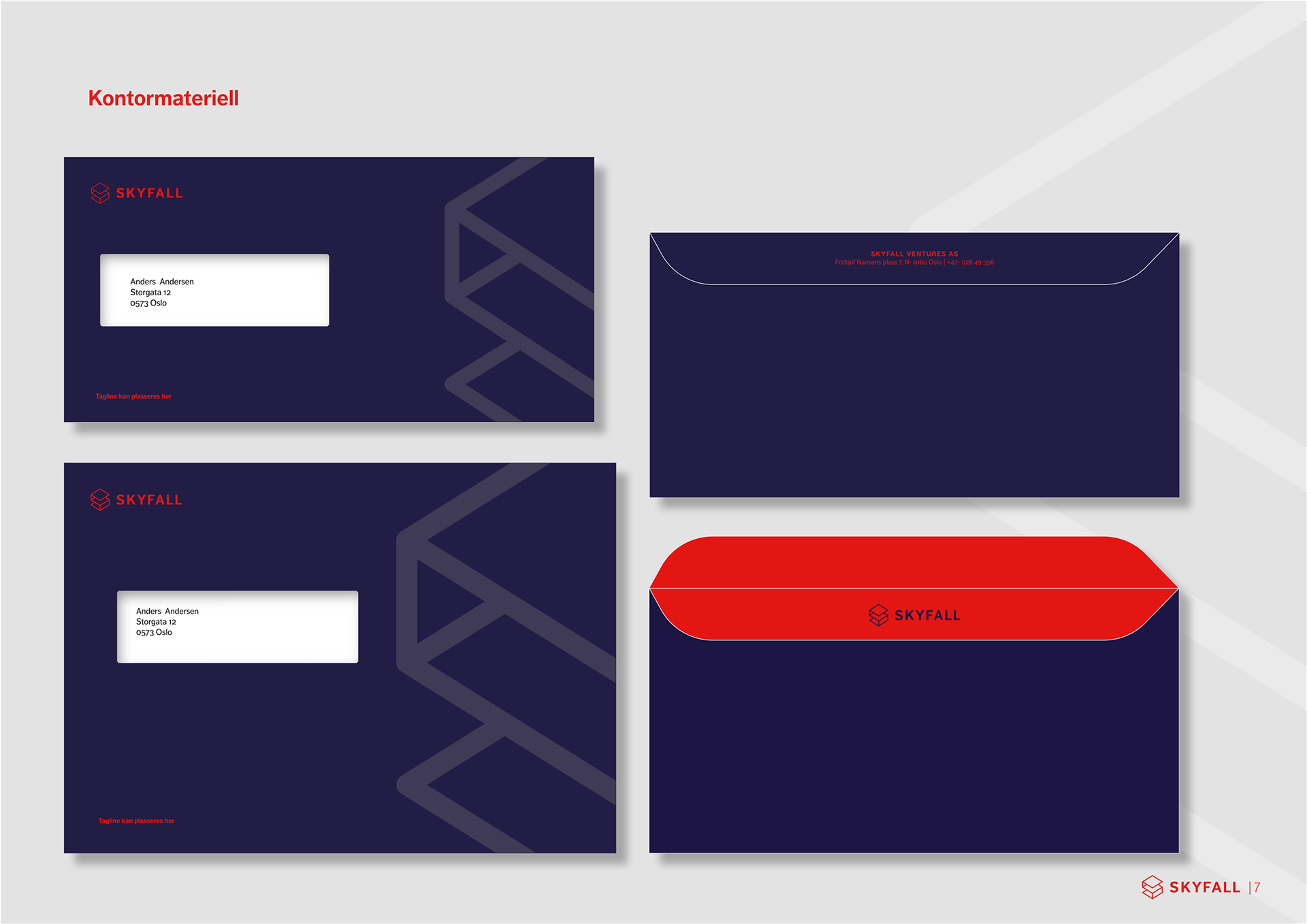
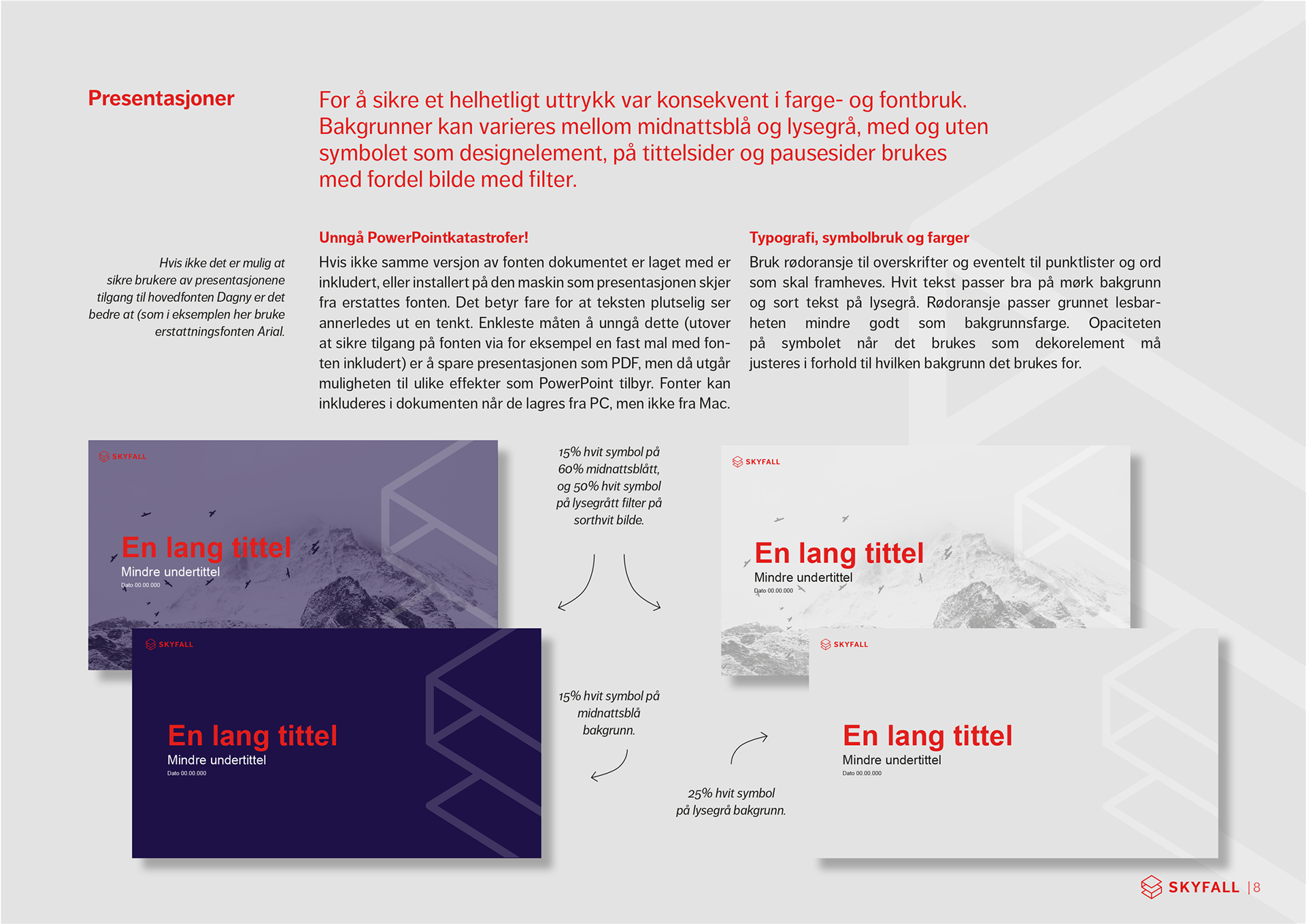
Skyfall ventures, visual identity
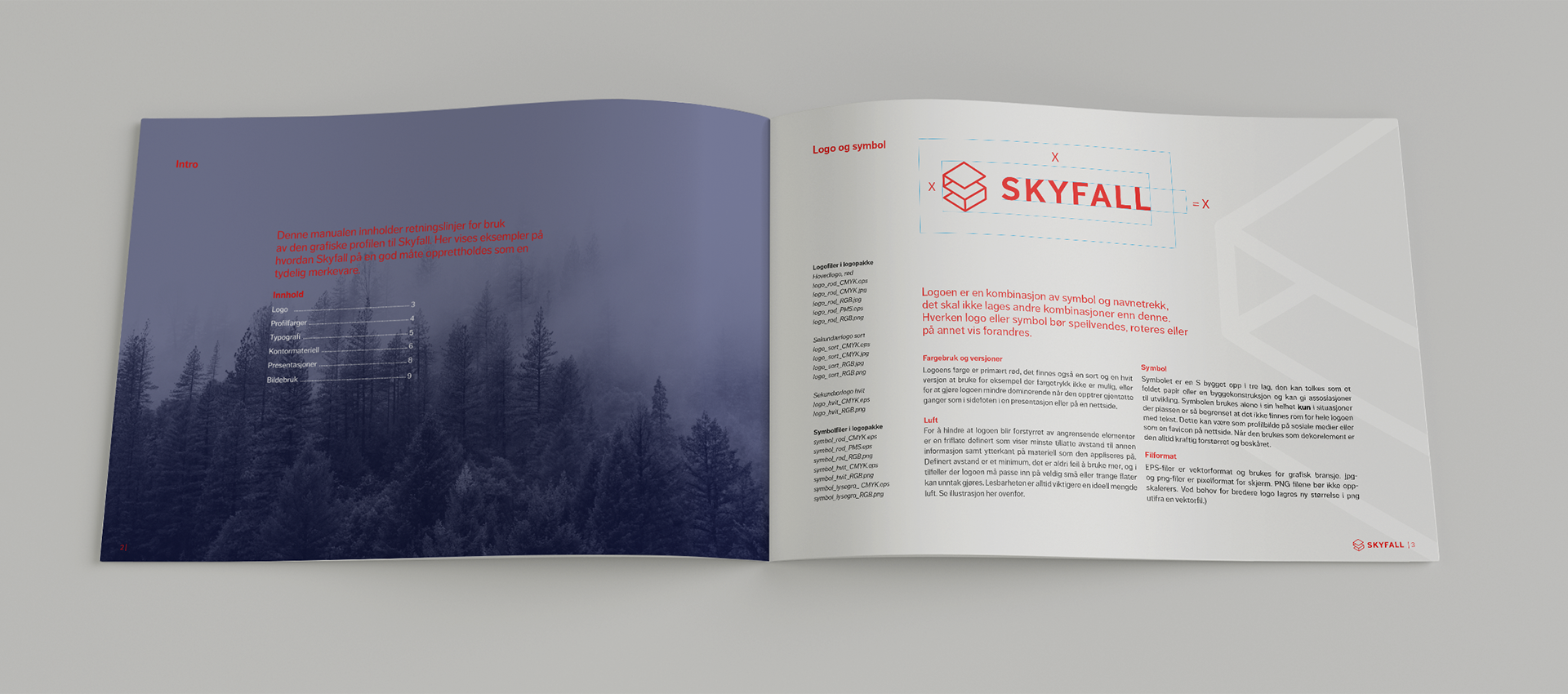
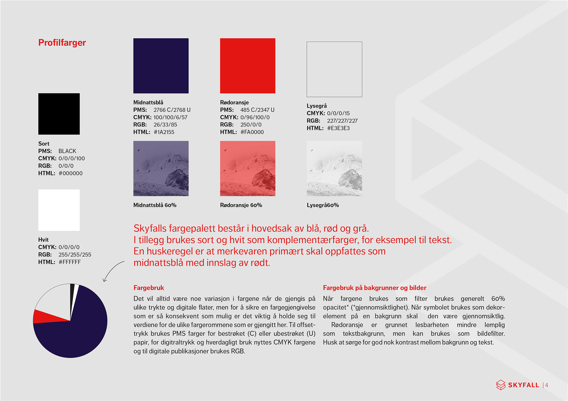
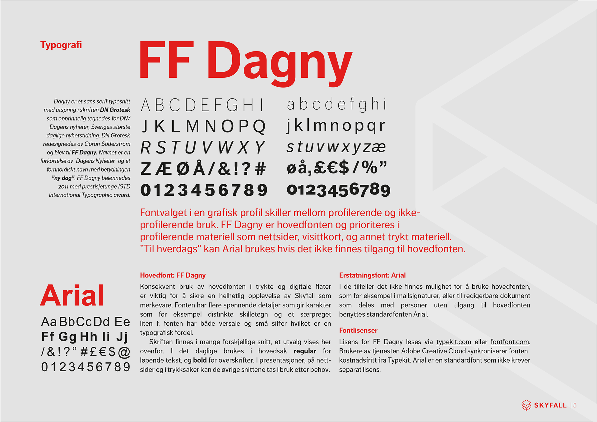
Skyfall ventures requested a mysterious feel for their profile, and this is the result.The symbol is the letter S made up in three layers, it can be percieved as a folded paper or some other three dimensional construction and give associations to development, and evolution. The symbol is used as decoration, and in places where there is not room for the full logo, such as a favicon on a website or as profile image in social media. The blue color signals trust, and in combination with the strong red logo a tension is created. Eerie landscapes with colored filters add to the dramatic feel. The fonts used are FF Dagny and Arial.