Rørosmeieriet, redesign
Client: Rørosmeieriet Agency: Form til fjells
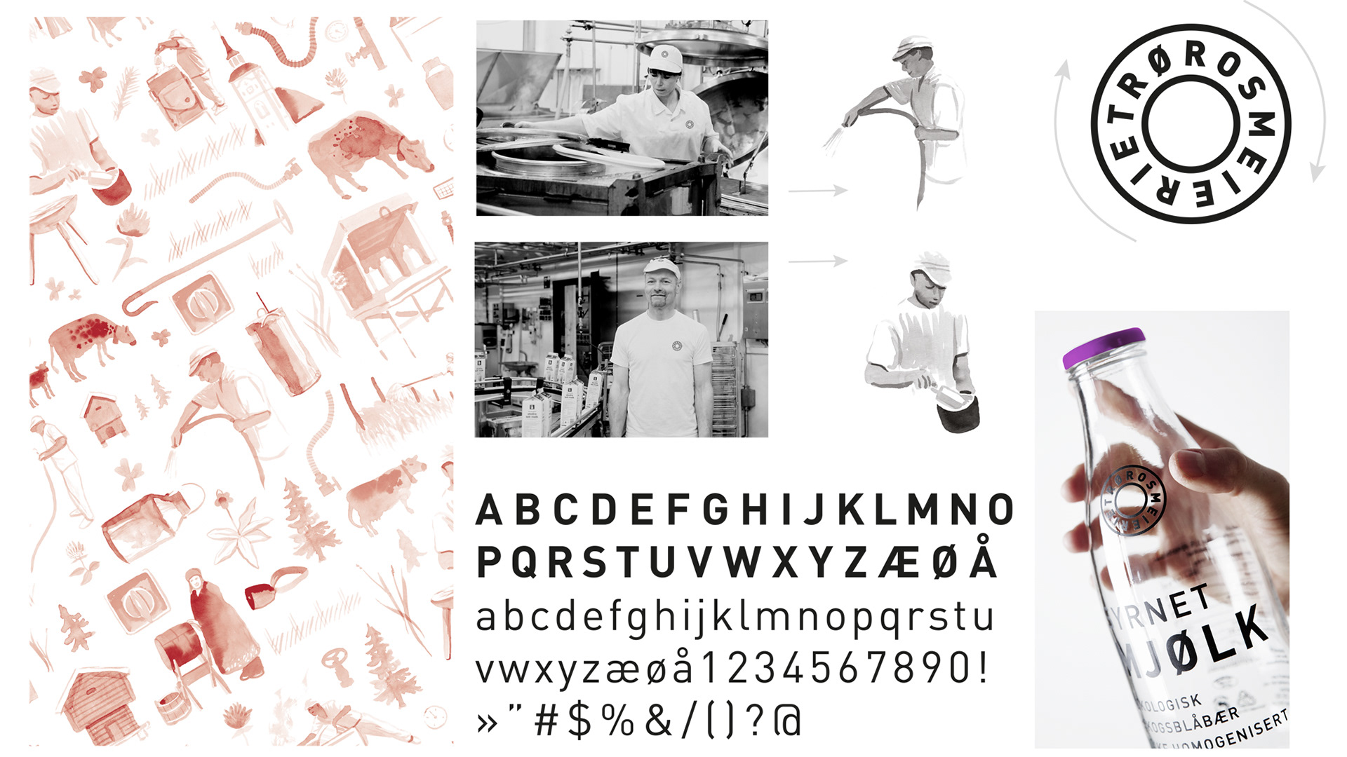
Photographer: Tom Gustavsen/Form til fjells Illustrator: Børge Bredenbekk/byHands
This concept was created during my time at Form til Fjells, our team worked with branding, visual identity and packaging design. The project was awarded with a Diploma in open category at Sterk Reklame in Trondheim 2013 for concept & packaging design and the final design was awarded with a diploma at Visuelt in 2014
This concept was created during my time at Form til Fjells, our team worked with branding, visual identity and packaging design. The project was awarded with a Diploma in open category at Sterk Reklame in Trondheim 2013 for concept & packaging design and the final design was awarded with a diploma at Visuelt in 2014
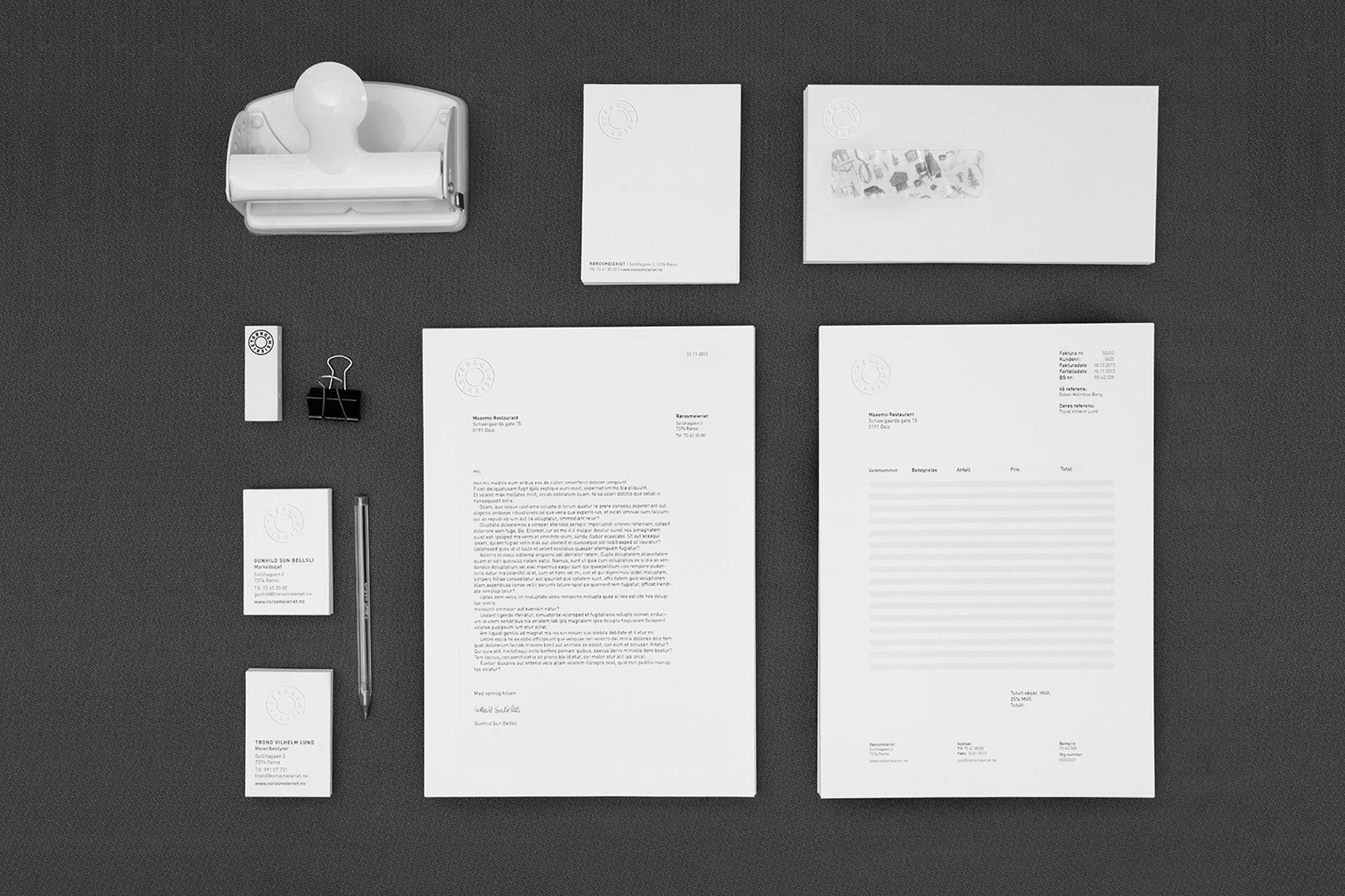
The identity communicates craft and ecology, and the connection to the world heritage listed city Røros.
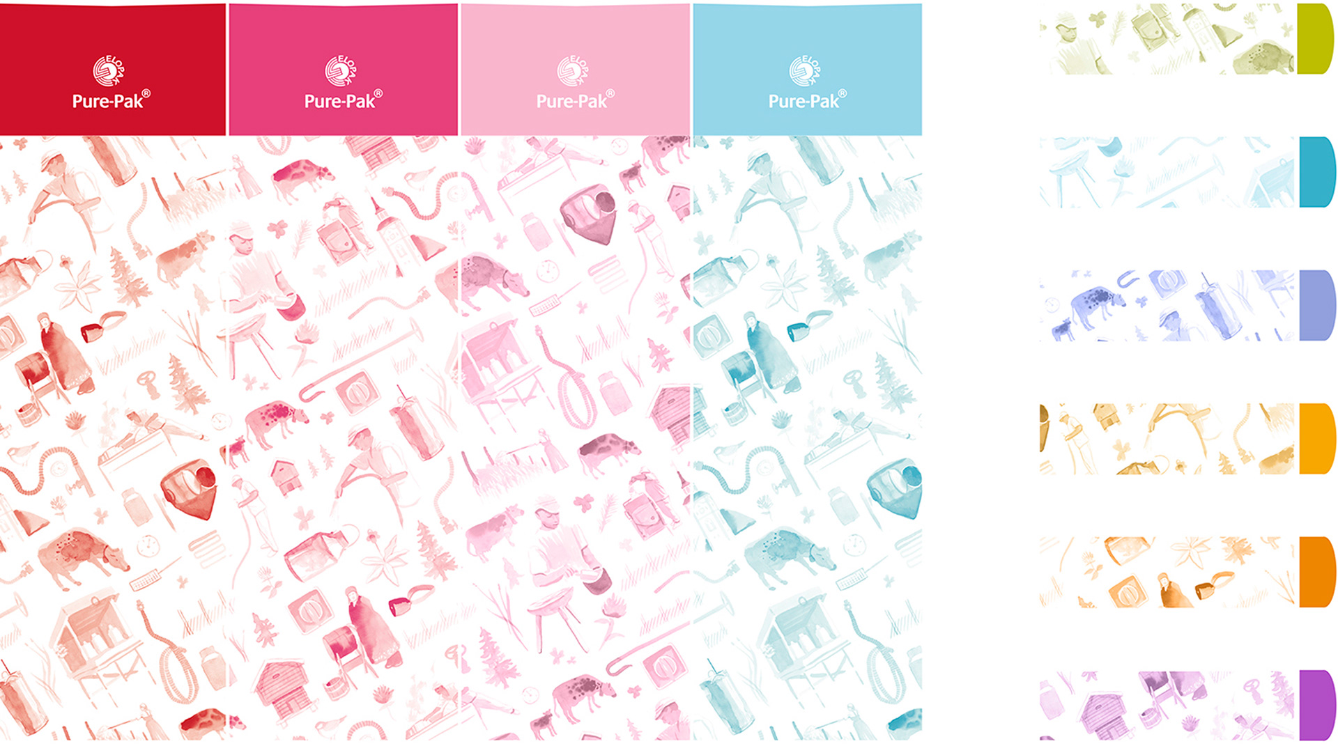
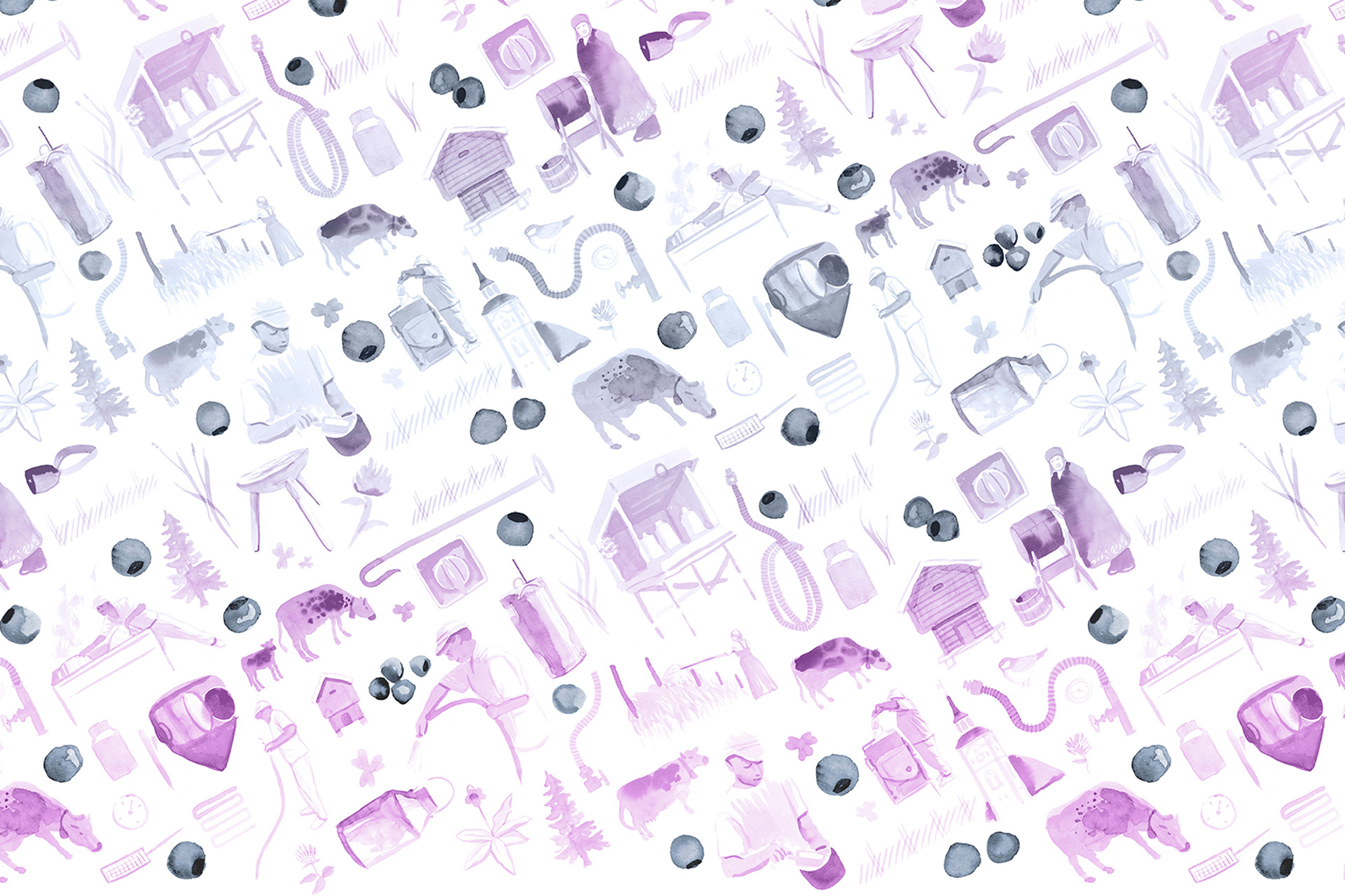
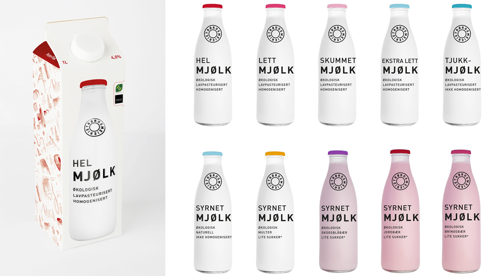
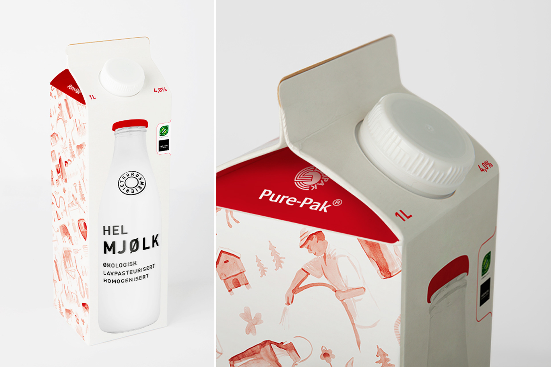
Bottles were silk-screen printed and photographed on a white background to be used on the packaging, and give a visual impression of actual glass bottles in store. Real bottles may be printed as giveaways and limited edition for special events. Detailed water-color illustrations create a pattern with elements from the history of the producer as well as the modern production. The illustrations are made by Børge Bredenbekk at byHands.
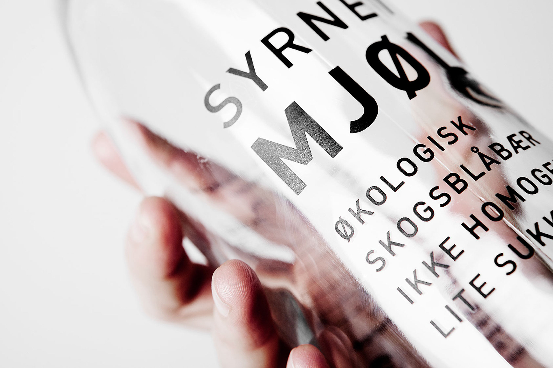
The illustrations create a sharp contrast to the black type and white backgrounds at the front display.
The backside of the package shows the back of the bottle with the table of contents, and there is room
for storytelling at the side of package.
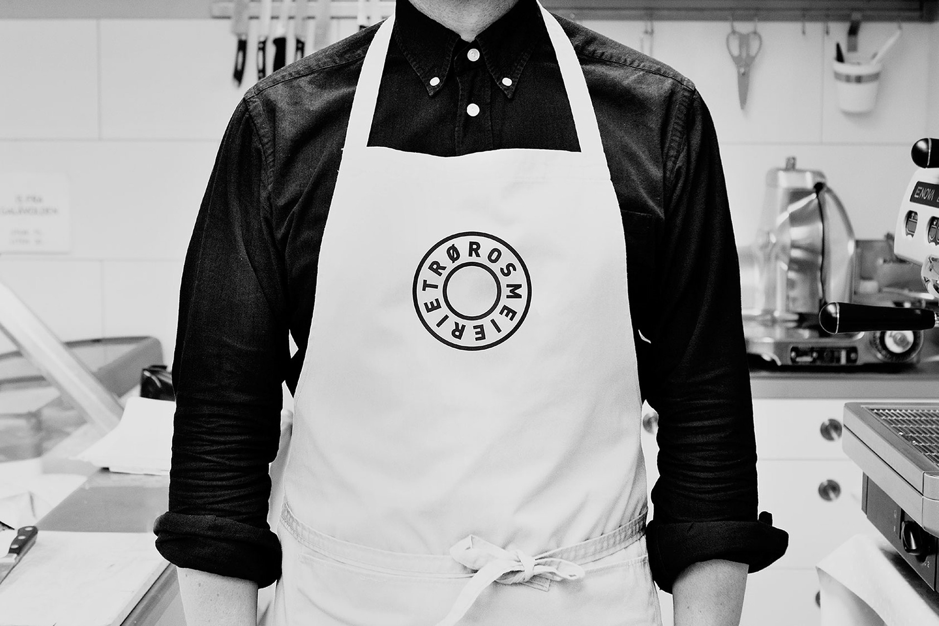
The logo is a text circle that when read creates a spinning movement to reflect the process of the production. The shape itself gives associations to the top of an old fashioned milk canister or the base of a milk glass. The concept is easy to alternate for future needs, it is easy to replace the illustrations with a new design, and change the fonts on the bottles, it would still be very recognizable after a redesign. The communication at the front of the bottles shows some of the unique characteristics of Rørosmeieriets products. Form til fjells has created the concept and design shown here, and the end result seen in stores is developed by Grow.