REMA 1000, Bars
Client: REMA 1000 Agency: Schjærven
Illustrator: Rune Markhus
I took part in developing this concept for Rema 1000 at Schjærven.
Illustrator: Rune Markhus
I took part in developing this concept for Rema 1000 at Schjærven.
We were a small team where I participated in all aspects of the creative process. From meeting the client, to working out a concept with names, colors and ideas for illustration, I also implemented the design.
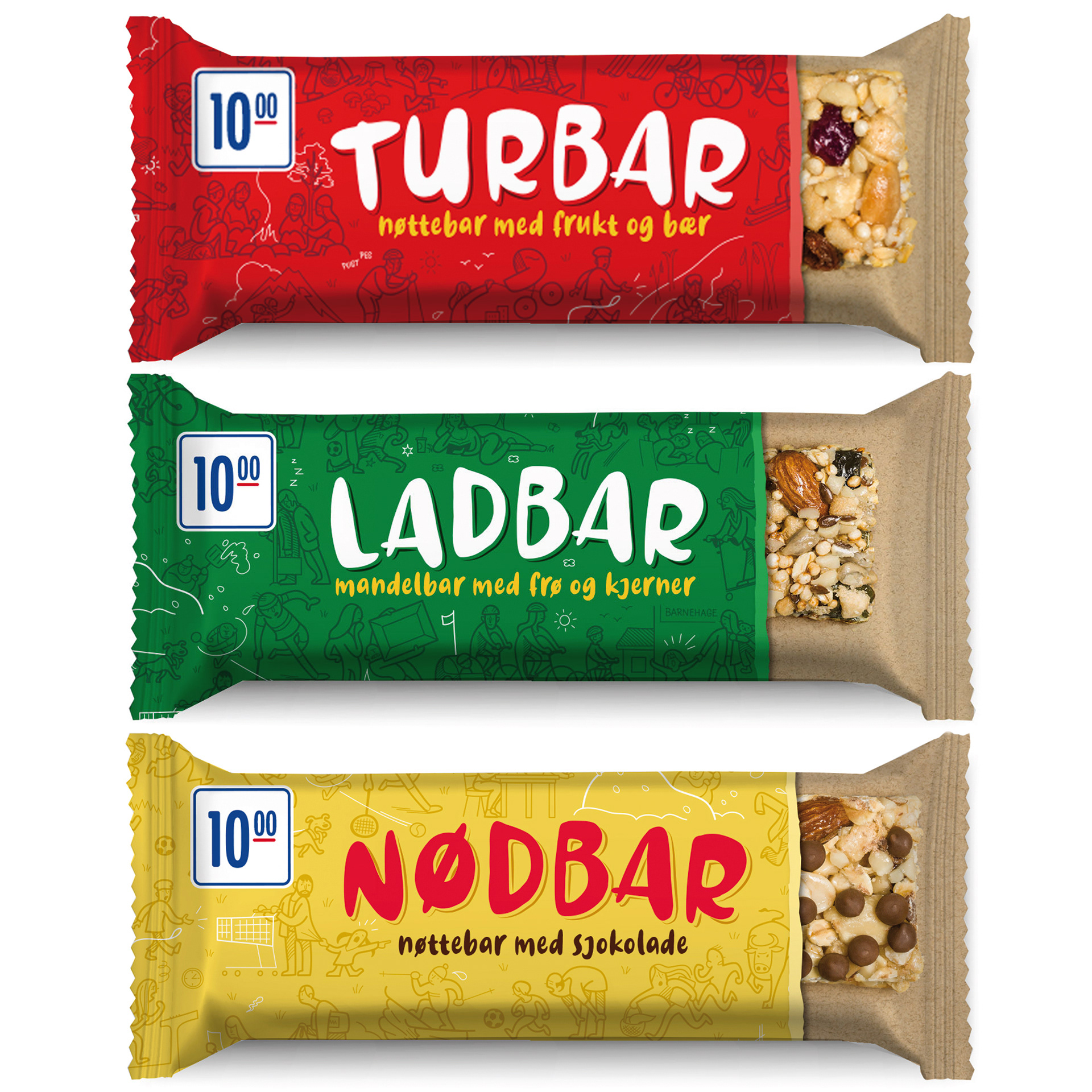
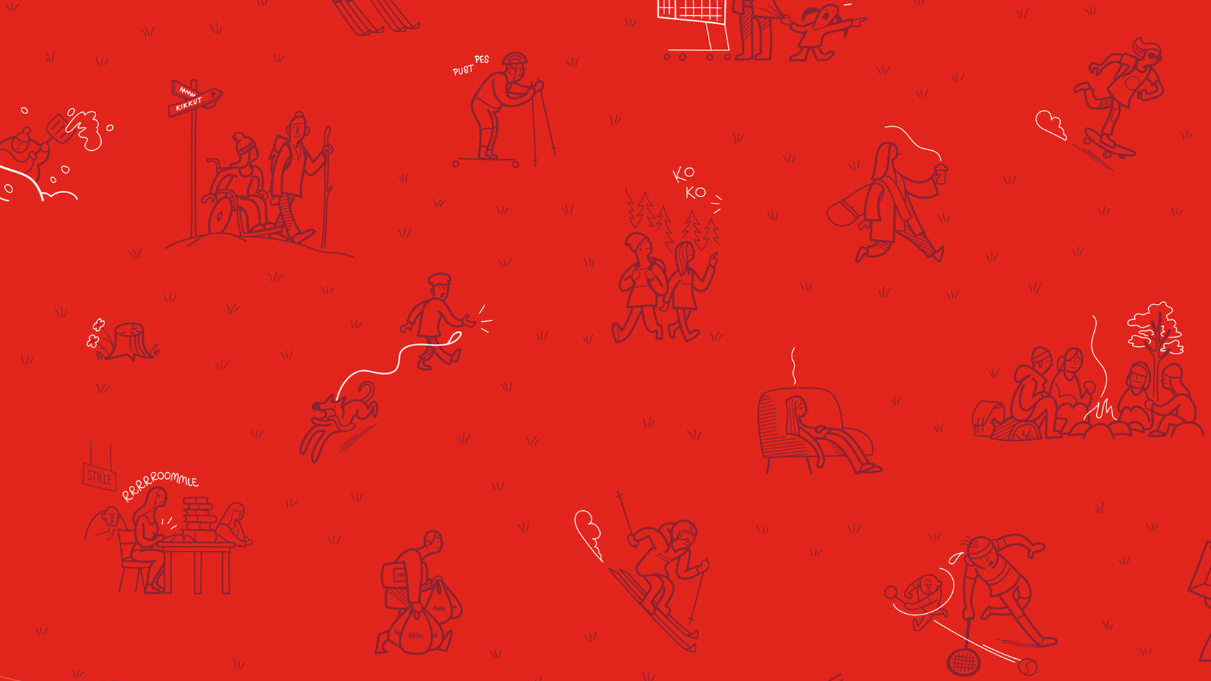
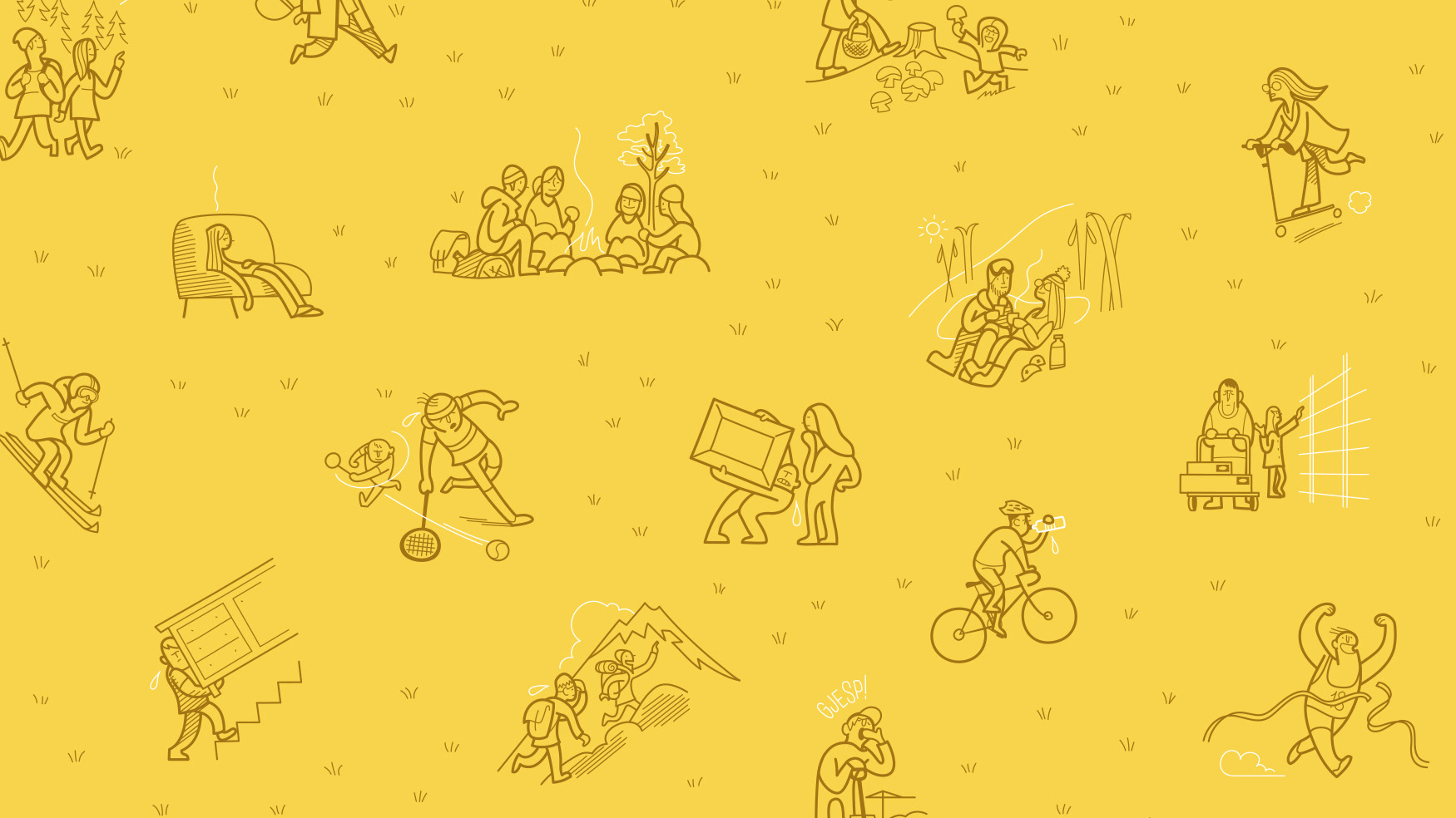
The bars have three different themes, the norwegian names are playing with the word "bar" and the themes of the illustrations are showing situations where a little snack might come in handy. We also made display packs.
(Note: The final design slightly changed after these mock-ups were made,
the "subtitles" are a bit different on the final products, and "Nødbar" is purple in store)
The bars have three different themes, the norwegian names are playing with the word "bar" and the themes of the illustrations are showing situations where a little snack might come in handy. We also made display packs.
Nødbar means "Emergencybar", Ladbar is "Rechargeable" and
Turbar means "Excursionbar"
Turbar means "Excursionbar"
(Note: The final design slightly changed after these mock-ups were made,
the "subtitles" are a bit different on the final products, and "Nødbar" is purple in store)