Kvikne-Rennebu Kraftlag/Kraftlaget
Client: Kvikne- Rennebu Kraftlag Agency: Form til fjells
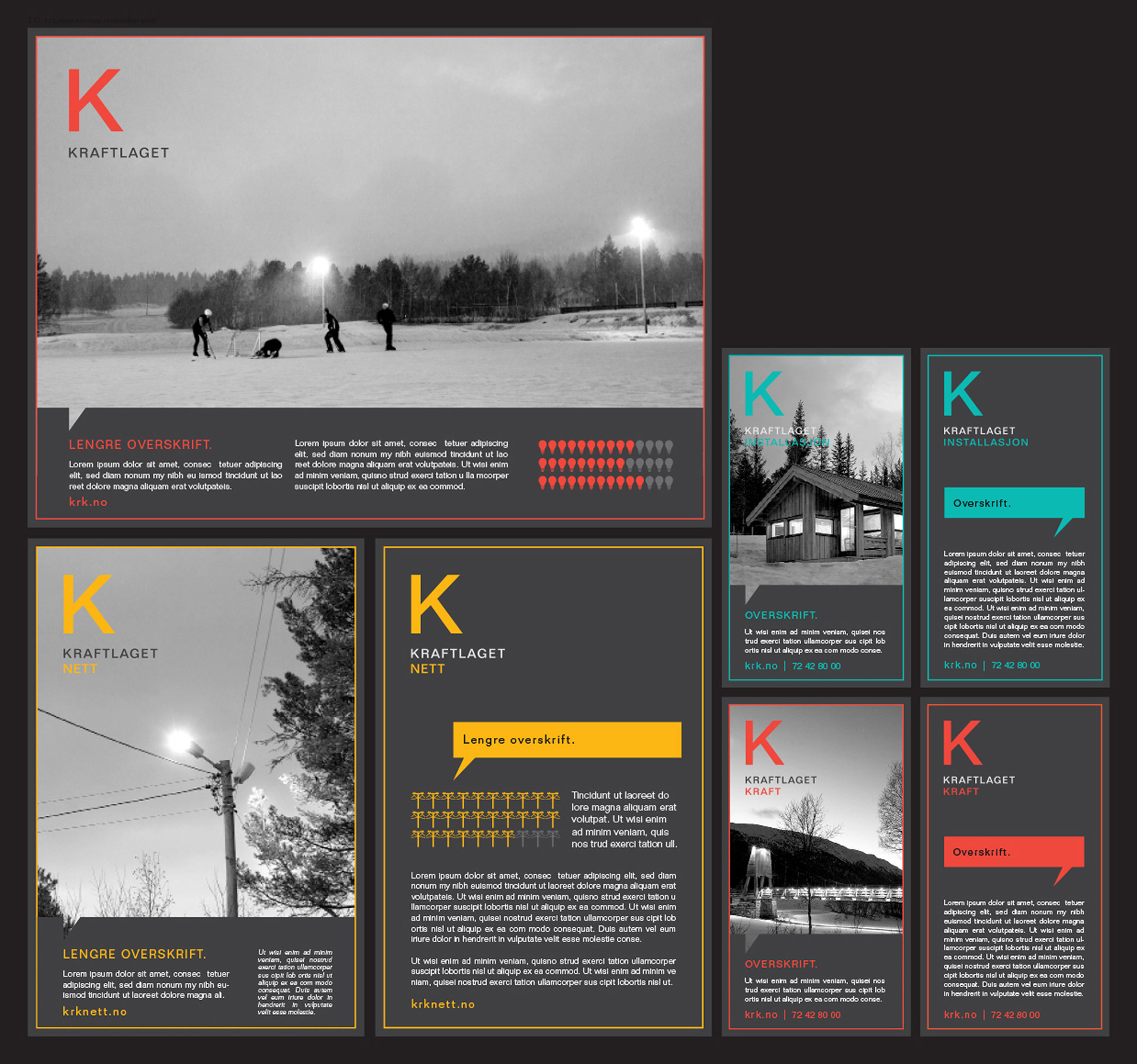
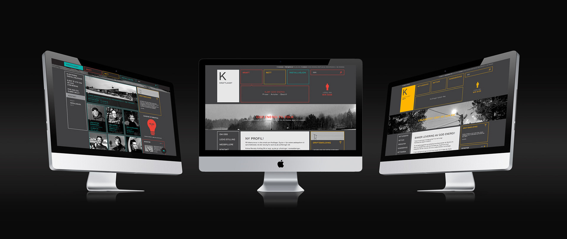
This concept was created during my time at Form til Fjells, Kvikne-Rennebu Kraftlag is a Norwegian power company, our team made a complete redesign and revitalization of the company image. The client requested a personal approach and a modern look. We worked with the slogan "God energi til folk"/"Good energy to people". Kvikne-Rennebu Kraftlag, which is the formal name, is long and presents marketing challenges on most surfaces. Their informal name has always been "Kraftlaget", and this is also the name they like to use when communicating with their clients, therefore the name change in the logo and marketing.
The fonts used for this project are Folio for print and Arial for web.
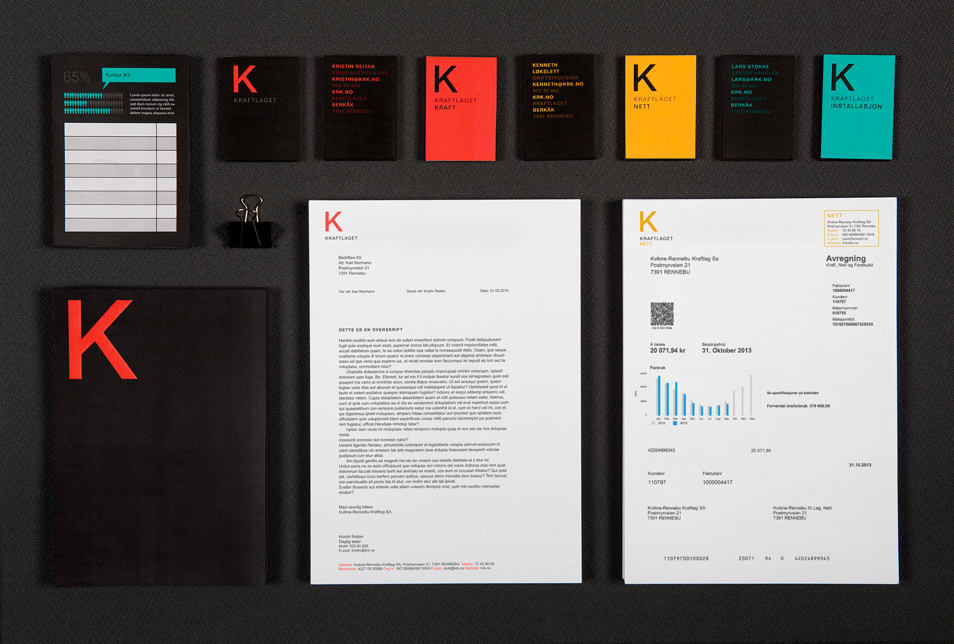
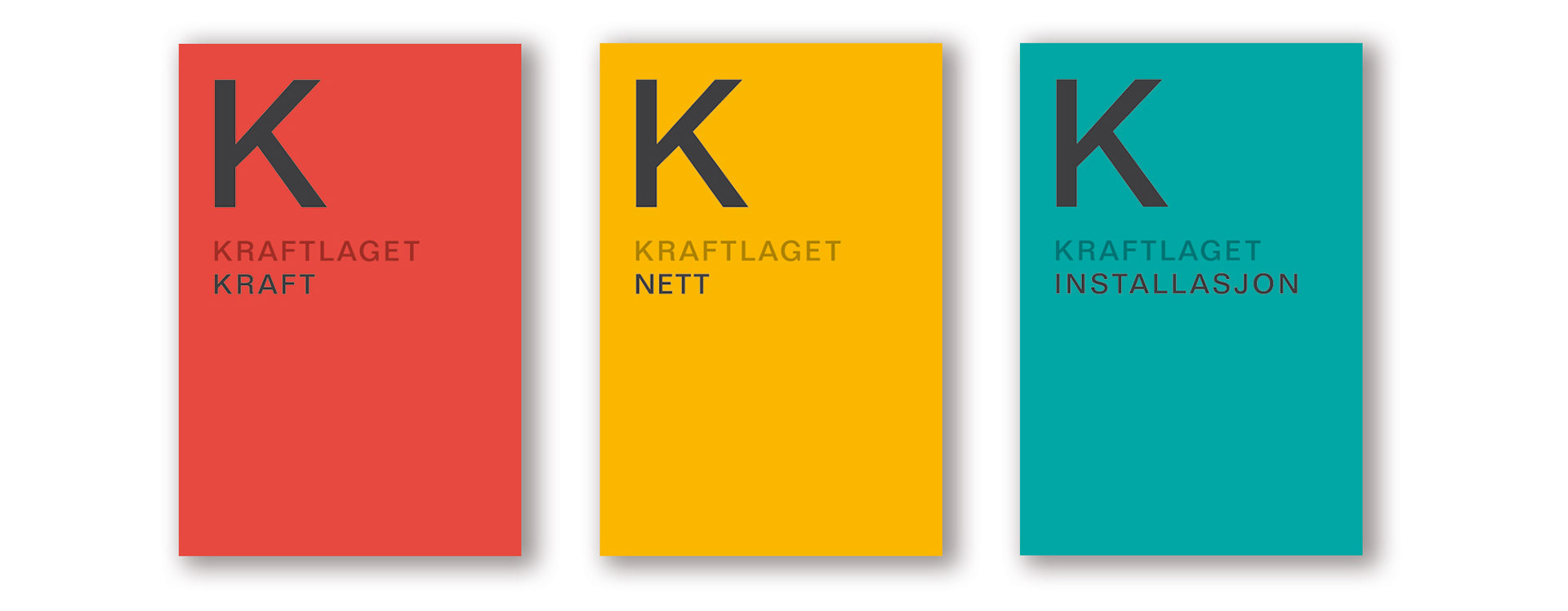
The letter K in the logo symbolizes a composite unit of Kraftlagets three departments; Kraft/Power, Nett/Network and Installasjon/Installation. These businesses have got their own colors with the department name in the logo. There is a need to separate these due to national regulations, Network is the monopoly business and is heavily regulated by NVE, while Power and Installation are subject to competition. The new logos marks the distinction between the services Kraftlaget is offering.
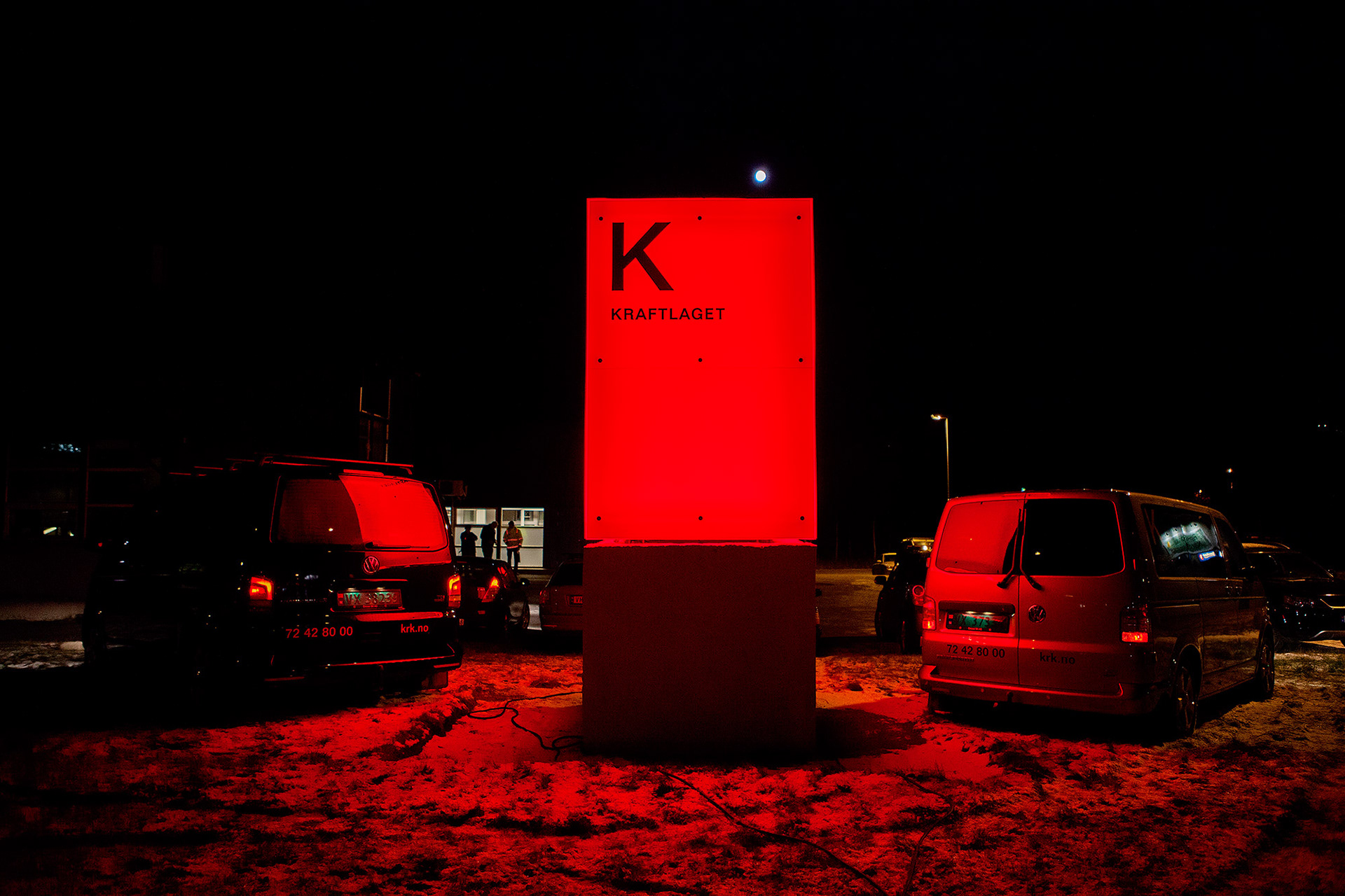
Colors consist of light, without light, no colors. Electricity and power are about contrasts, about light and dark, heat and cold. There is rarely anything in between, the power is either on or out. The light is on or off. Kraftlaget delivers good energy to people and has the task to provide customers with what we often take for granted, light and warmth. The profile colors are grey, red, yellow and green resting on a dark grey background or black and white photos. The bright "light in the dark effect" also gives associations to old fashioned neon signs and now also the lightbox that is seen outside the headquarters in Berkåk that alternates between the main profile colors.
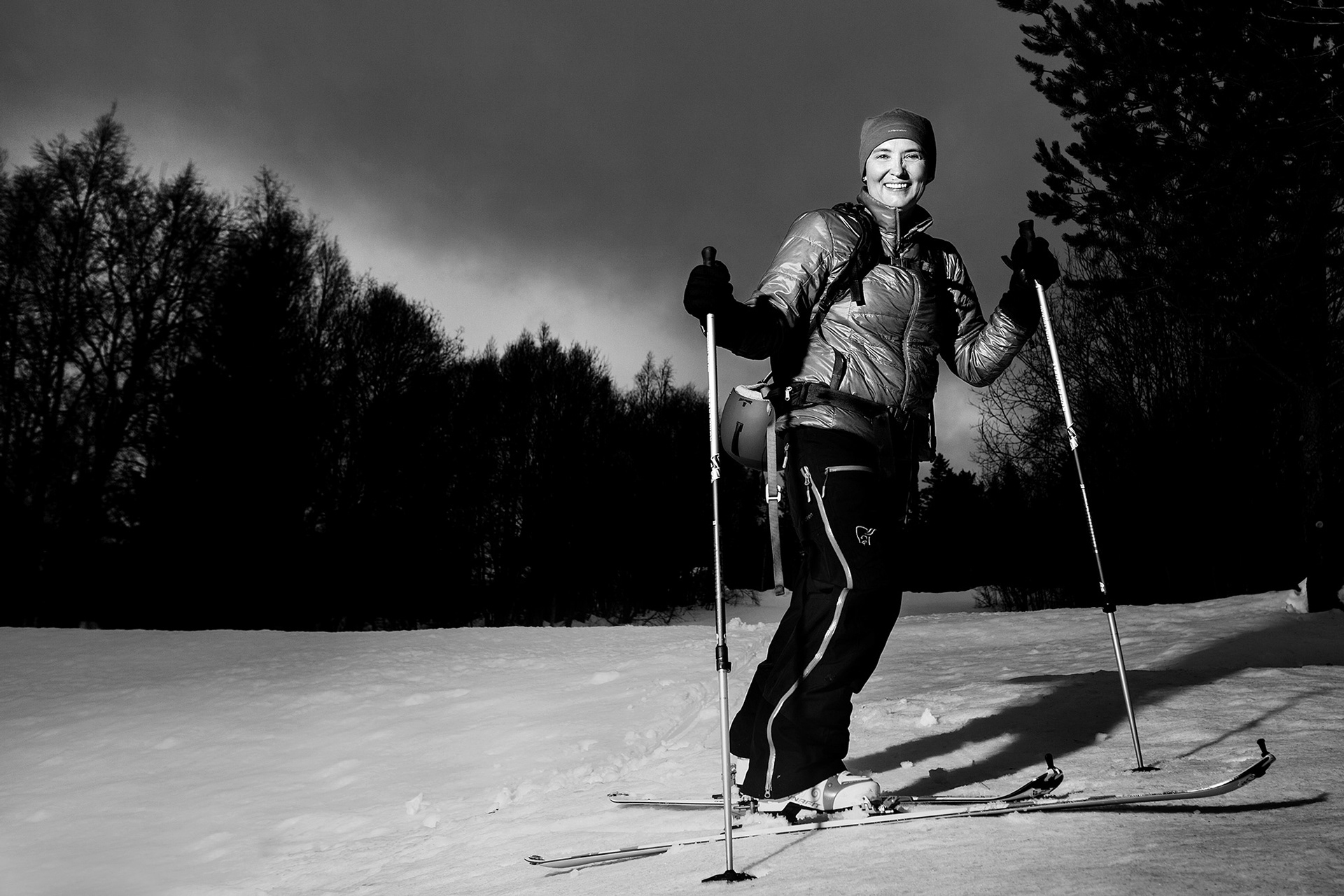
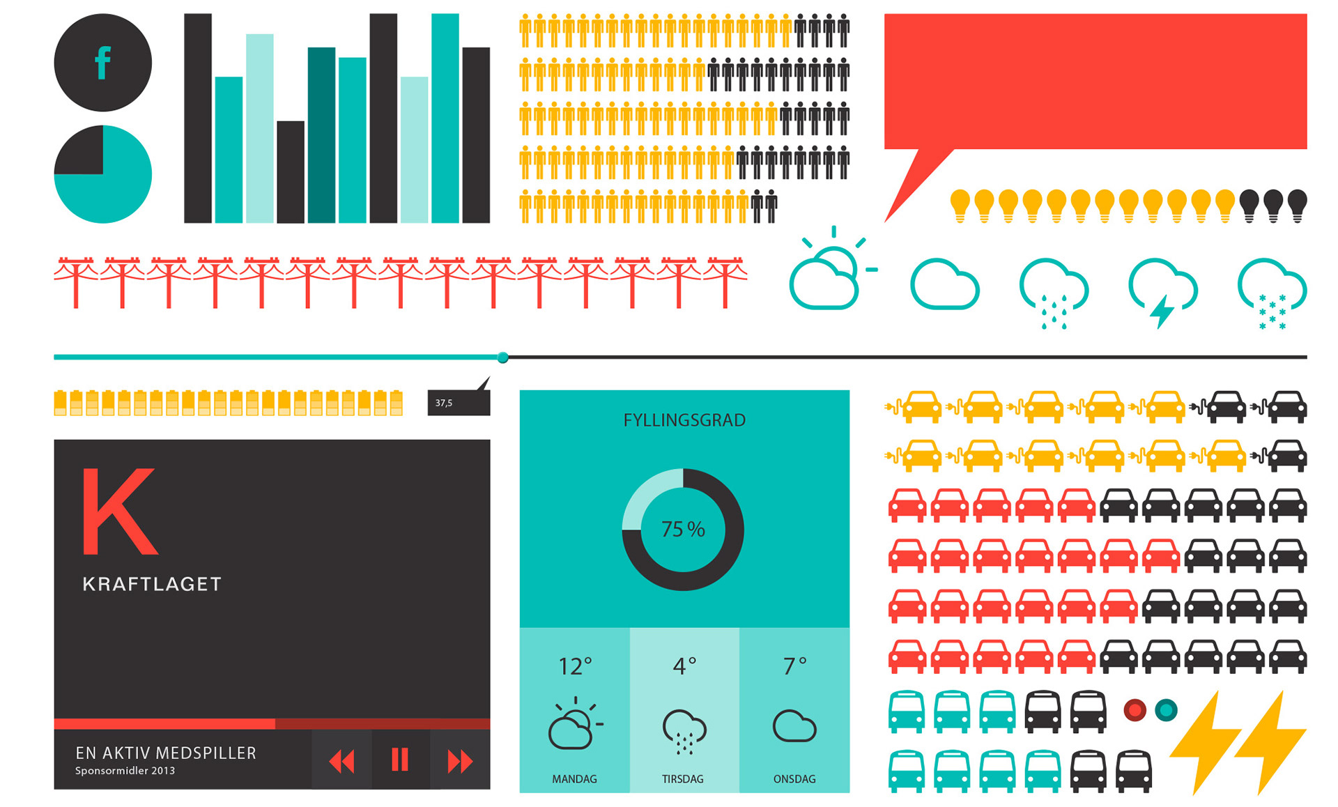
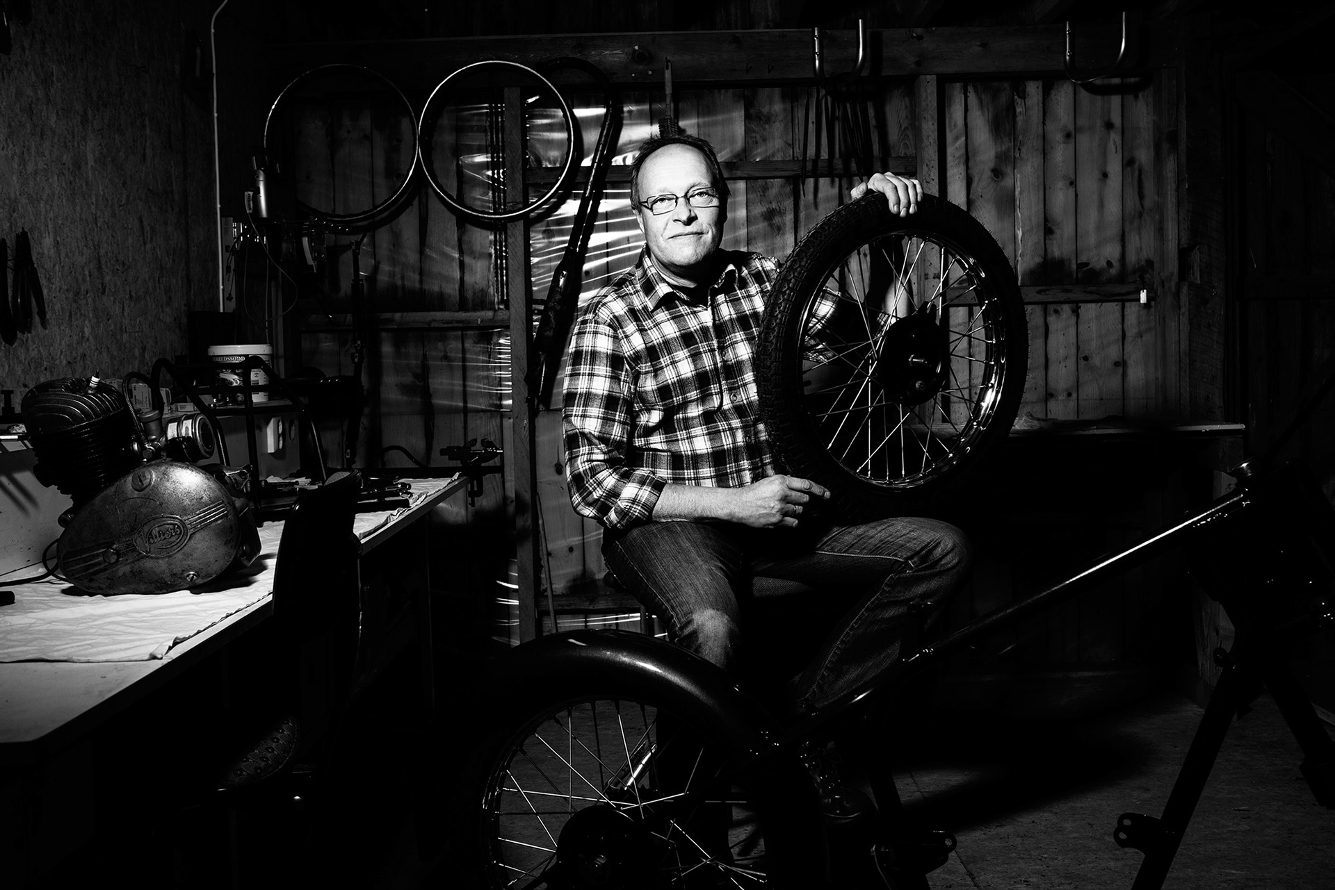
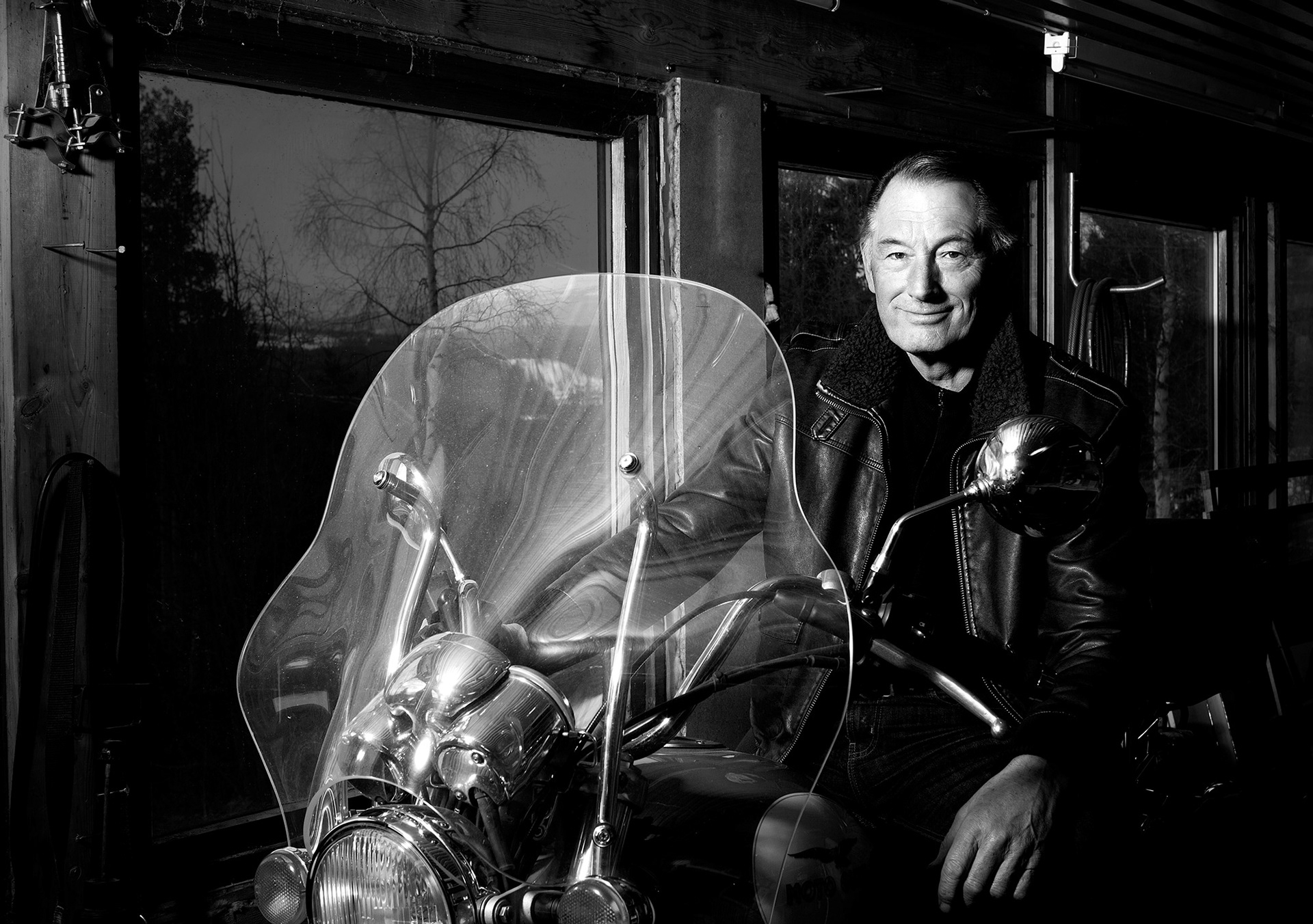
The profile photos communicate "Good Energy to People", they convey a warm, and close connection to Kraftlaget and visualizes the values they supply and stand for. All images are photographed in the supply area of Kraftlaget and the people represented in the portraits are employees doing things that gives them good energy. This gives a more personal touch than what a traditional static portrait would do. We also took other illustrative images to reinforce Kraftlagets value for the local community. The images are used for profile building, marketing, website and so on. This really was a good energy project! We visited more than 30 employees and there were lots of good energy, and a fair amount of planning needed, and ironically a storm and a short power outage on one of our trips to Kraftlaget! Below are some examples of advertisements, the images are used in combination with technical objective information and infographics. The infographics are visualizing "fun facts" related to power and electricity, mainly with a local twist in the format of "Did you know that..."